
Most organizations wait until something is broken to touch their logo. The better time is right before you ask people for something: a new location, a new program, a capital campaign. A launch puts the mark in front of more people, more often, in more places than any other season in an organization’s life. Every pledge card, grant application, sign and banner becomes a small moment where someone decides whether you know what you are doing. The mark answers before a word is read.
A refresh is not a rebrand. A rebrand says we are becoming something else. A refresh says we know exactly what we are, and we have made it sharp enough to carry what comes next. For an organization with history, that is the stronger message. Longtime supporters see that nothing they love is being thrown away. Newcomers see an organization that takes its own story seriously.
City of Refuge Christian Church of Northwest Indiana is in that season. The church is entering a capital campaign for a new main campus in Portage and a satellite in Gary, with four ministries under one name: the church, Liberty House Recovery Café, Emma’s House transitional housing, and the City of Refuge Christian Academy. Enthrall is running that campaign, and the first thing I asked for was the logo file. What follows is the story of that mark, what I changed, what I kept, and the system that now holds it together.
The Job the Mark Has to Do
Before the first ask goes out, the mark has one job. The intent is simple: breathe new life into the brand as the church revives its fundraising initiatives and supports new growth and expansion. Before you ask people to invest in where you are going, show them you know where you came from. Done with precision, that is how an identity carries a campaign.
Where the Mark Comes From
Before there was a City of Refuge in Northwest Indiana, there was one in a warehouse in Waipahu, on the island of Oahu.
Pastor Wayne E. Anderson, who founded the first City of Refuge Christian Church in Hawaii in 1980, was a young Army man from New York stationed at Tripler Army Medical Center. He started the church in February of that year with seven people, ministering to active duty soldiers and their families. In 1985 the church moved into the old Waipahu Theater. By the time he went home to the Lord on 14 January 2024, at 69, he had pastored that congregation for 44 years, written books, carried a television broadcast called “You Have A Right To Be Free” across the Hawaiian Islands and into Asia, and planted a fellowship of sister churches across the mainland. His church called him Apostle. His people called him Dr. Anderson.
That fellowship is where City of Refuge Christian Church of Northwest Indiana comes from. In 2006 Pastor Michael Pirtle started the church in Merrillville. He is my father, which is how I know this history first hand; for this work, the church is a client, and I have treated it like one. By 2011 the church was five years old and hosting the sister CORCC churches for its anniversary. By 2015 the Hawaii church listed thirteen sister congregations on its site, from Washington State to Virginia to New York, and “CORCC Merrillville, Pastor Michael Pirtle” was one of them. The statement of faith on the church’s site today is, nearly word for word, the one Pastor Anderson’s church published. So is the line on its door: you have a right to be free.
The emblem came with that inheritance. A circle. A cross. Rays of light. A skyline. It is the mark Pastor Anderson sanctioned, and it has been on the church’s sign, its shirts, its bulletins and its website for as long as the church has existed.
What the Symbols Say
I have not found Pastor Anderson’s own notes on the mark written down anywhere, so this is how I read it, and Pastor Pirtle can correct me.
- The cross is not drawn. It is the one place the light does not fill. You see it because everything around it shines. That is the gospel in one shape: the cross is where the glory breaks through.
- The rays fan out from a single point low in the circle, behind the city. Light coming up over a skyline. Morning. A new day for a city.
- The skyline is the city of refuge itself. In the Word, God told Israel to set apart six cities where a person who had taken a life without meaning to could run and be safe until the matter was heard. Numbers 35 and Joshua 20. Whoever got inside the gate was protected. That is what a church is supposed to be for people who are running: a place inside the gate.
- The circle holds all of it together. One body. One city. Nothing outside the line.
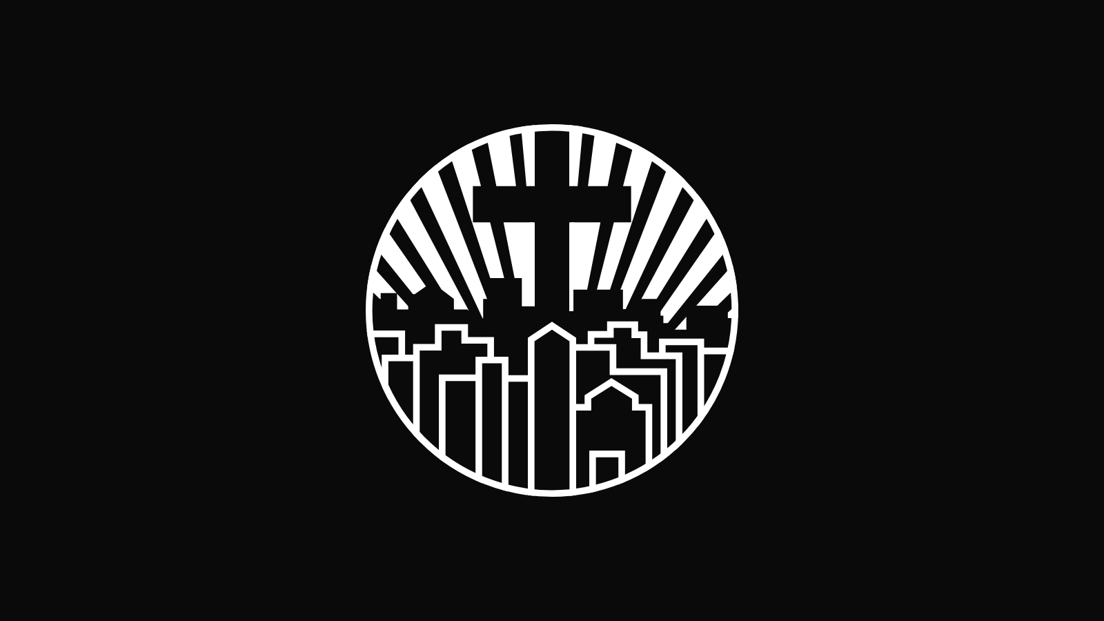
The mark in white on black. Every shape is one colour; the cross is the cut-out.
Why Now
This October the church opens a capital campaign to build its main campus in Portage and open a satellite in Gary. The mark is going to be on everything.
A new sanctuary on the six acres at 5402 US Highway 6. A former Christian school on twelve acres at 1150 West 49th Avenue in Gary, with an offer in. Four ministries that tell one story: the church, Liberty House Recovery Café, Emma’s House, and the City of Refuge Christian Academy. Pledge cards, a case statement, grant applications, a building sign, a banner at the groundbreaking. For the next few years this emblem will meet more people than it has in the last twenty. A campaign is the church asking its community to believe in what comes next. The identity has to look like it already believes.
So I looked hard at the file the church had. It was a 1,170 pixel raster off the website. It had served faithfully, but it could not go on a sign eight feet wide, and up close it showed its age: a hairline rim, three thick wall arcs, buildings whose strokes did not meet, and a tower that sat a little left of the cross above it.
There was a second reason. The Hawaii church and the wider network, Cities of Refuge Christian Churches Global, have since adopted their own identities: a script wordmark inside a double ring in Waipahu, a blue and silver shield with the globe for the network. Both are good marks for the work they do. It also means the original emblem, the one from the beginning, is now City of Refuge’s to carry. Nobody else is using it. I did not want to replace it. I wanted to bring it back the way it was always meant to look, so that when the church asks for the next twenty years, the mark on the ask looks like the one people have trusted for the last twenty.
It is just a refresh. But a refresh can breathe life back into an image and into the story behind it, and that is exactly what a church about to build needs: to remember where it came from while it decides where it is going.
What Changed
I rebuilt the mark as geometry, not a trace. Every shape is now a rule the eye can trust.
The old file was pixels. The new file is a true circle, fifteen ray wedges spaced on a fixed beat, a cross cut from the light, and a skyline drawn in fifteen clean polylines at one stroke weight. It scales from a favicon to a billboard with no loss. On top of that, I corrected three things on purpose, and left everything else exactly where it was.
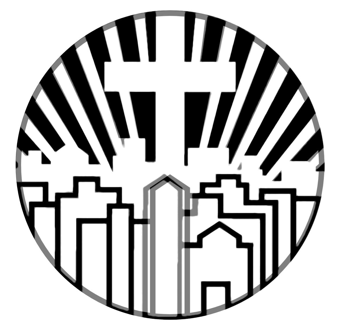
The proof. The new vector blended fifty percent over the original raster. Where the two agree the lines are solid; where they differ you see a soft double edge. The cross, the central tower and the rays at the top move. Nothing else does.
1. The Cross and the Tower Are on the Axis Now
In the original, the cross, the ray origin and the central tower did not share a centre line. The tower sat about two and a half percent of the width left of centre. Small, but the eye reads it as a lean. All three now sit exactly on the vertical axis. The cross stands over the tower, and the light comes from directly beneath it.
2. One Stroke Weight
The skyline used to be drawn at several widths, with a hairline rim around the disc and three thick wall arcs along the lower edge. The whole city is now one line, 17.8 units on a 1,000 unit mark, with true miter corners. The disc is bounded by a uniform ring at that same width. One weight, one voice.
3. A True Circle and a Fixed Fan
The disc is a mathematical circle. The rays are fifteen wedges, 3.9 degrees wide on a 6.89 degree beat, all from one origin low in the disc. The rhythm was always there. Now it is exact.
4. The Slit Is Closed, the Notches Are Gone
Two artifacts of the old file. A thin slit of light ran between the tower and the building beside it where two strokes had not quite met. And two corners carried a stair-step where the raster had been resized. Both are gone. The joints are solid.
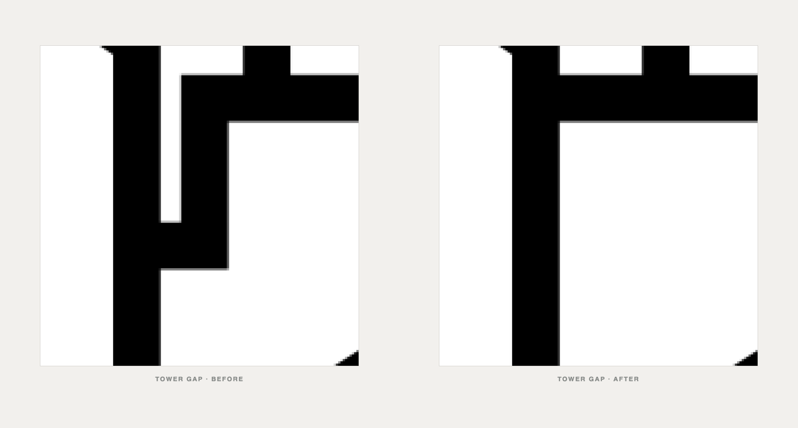
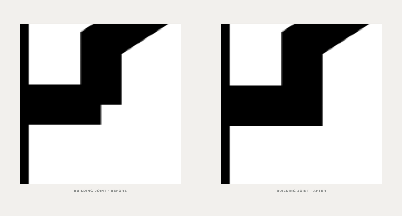
Crops at the same scale from the original raster (left) and the new vector (right).
What Stayed
Almost everything. If you have been at City of Refuge for twenty years, you should not be able to tell me what changed without the overlay.
- Every building. Fifteen shapes, the same footprints, the same heights, the same asymmetry. The skyline was never symmetrical and it still is not. The city on the left is not the city on the right, and that is right.
- The ray rhythm. Fifteen rays, the same count, the same spread, from the same low origin. I made the beat exact; I did not change the beat.
- The cut-out cross. Still unfilled. Still made of light. Same width, same height, same crossbar.
- The proportions. The disc, the horizon line where the rays end and the city begins, the height of the tallest tower against the rim. All as they were.
- The colourway. Burgundy was the original colour. I confirmed it with the church’s own archive: the website carried the emblem in burgundy in 2015, and in 2011 the church sold burgundy shirts with the mark in white. It comes back as the lead colour.
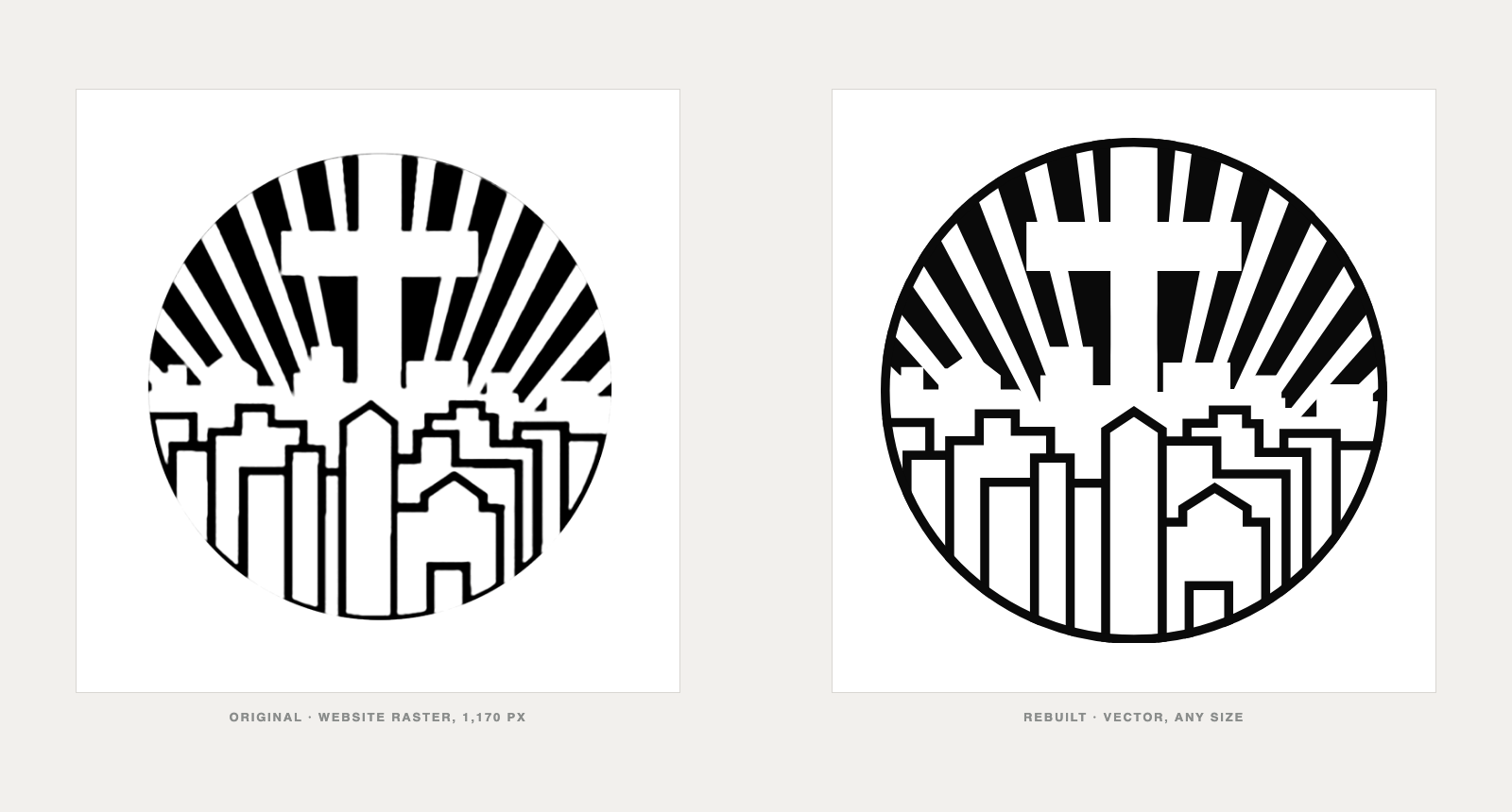
Left, the original website raster at 1,170 pixels. Right, the rebuilt vector, which now works at any size.
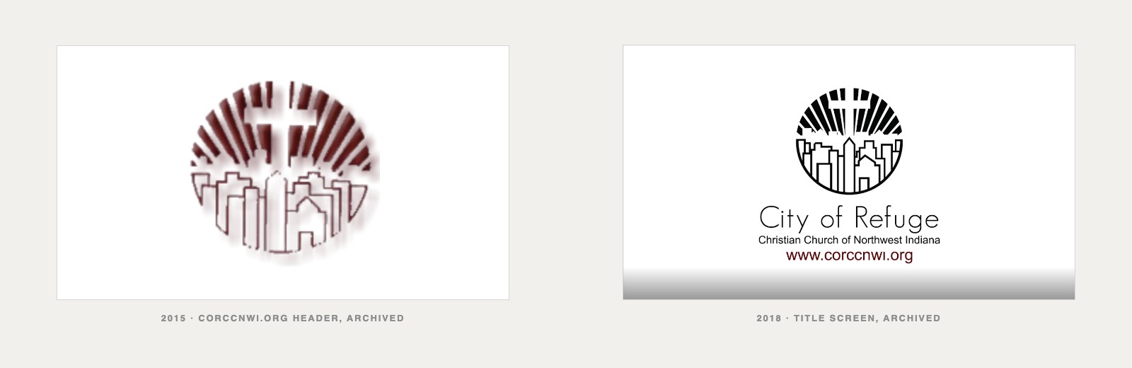
From the Wayback Machine. In 2015 the site rendered the mark in burgundy with a bevel; by 2018 it was flat black. The new system keeps the colour and drops the bevel.
The System
Three colours, one mark, a few rules. Enough to keep it right on a pledge card and a building.
Colour
| Colour | Value | Use |
|---|---|---|
| Burgundy | #76232F · Pantone 188 C · RGB 118 35 47 | The lead colour, and the original one |
| Black | #0A0A0A | Print and single-colour use |
| White | #FFFFFF | The mark on dark and on burgundy |
Burgundy is confirmed as the original colourway. The production value is #76232F, Pantone 188 C: it sits between the two readings from the 2015 archive and it is a stock ink and thread colour, so print, embroidery and screen carry one burgundy.
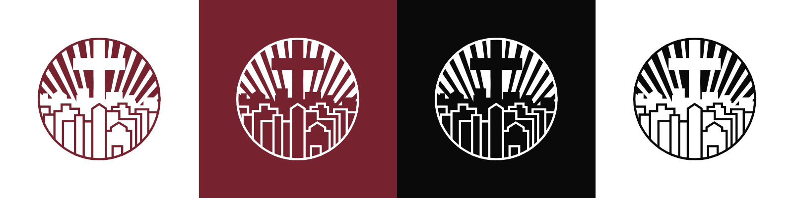
The three approved pairings: burgundy on white, white on burgundy, white on black. Black on white is the fourth, for print that cannot carry colour.
The Mark at Size
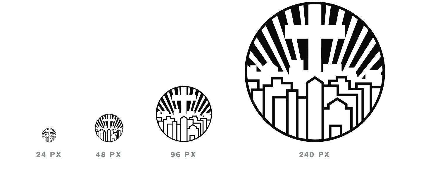
Minimum size: 32 px on screen, 0.4 inch (10 mm) in print. At 24 px the ring is under half a pixel and the skyline closes up; that size is shown so you can see why. For a favicon or an app icon, use the 512 px PNG and let the device scale it; do not redraw a simplified version.
Clear Space
Keep a margin of four ring widths clear on every side. The ring is 1.78 percent of the mark’s diameter, so the clear space is about 7 percent of the diameter: 17 px on a 240 px mark, a little over half an inch on an 8 inch sign.
Nothing goes inside that margin: no type, no photo edge, no other logo. The wordmark “City of Refuge · Christian Church of Northwest Indiana” sits below the mark, outside the clear space, centred on the axis.
Do Not
- Do not stretch, squash or rotate the mark.
- Do not add a bevel, a drop shadow, a gradient or a glow. The 2015 bevel is the one thing from the archive that stays behind.
- Do not recolour outside burgundy, black and white.
- Do not outline the mark or put a second ring around it.
- Do not crop the ring or let it touch an edge.
- Do not place it on a busy photo without a solid plate behind it.
- Do not move the buildings to make it symmetrical. It is not symmetrical on purpose.
- Do not use the old raster file. It is retired.
What This Says About the Work
This is how Enthrall approaches identity for a client that is about to grow. The mark is rebuilt as a system, not a picture: geometry the eye can trust, one stroke weight, one colour value that print, embroidery and screen all agree on. Every rule fits on a page, so a volunteer laying out a pledge card and a sign company cutting an eight foot letter make the same decisions without calling anyone. The files are ready for any vendor the campaign hires, in every colour and size it will need, before the first ask goes out. Nothing about the church’s story was changed to get there. It was just made sharp enough to carry what comes next.
We did not change the mark. We cleaned the glass it sits behind. Now let’s build the city it points to.
Mike Pirtle is the founder of Enthrall Brand Solutions (est. 2009). City of Refuge Christian Church of Northwest Indiana is an Enthrall client; this identity work is part of the capital campaign Enthrall is running for the church. Sources and verification notes are on file with the identity brief.